Getting Lost: A Script Font That Elevates Digital Branding
Two weeks ago, I was finalizing the hero section for a new coaching website — minimalist layout, soft neutral palette, and a single bold headline over a blurred background image. The client wanted “warmth without clutter, elegance without pretension.” I opened my font library and tried three options before landing on Getting Lost. Instantly, the headline felt intentional — not just readable, but resonant.
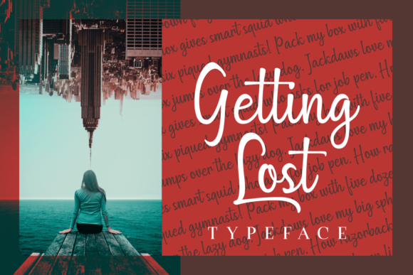
Getting Lost is a script font from Script Amp that walks a rare line: it’s expressive enough to carry personality, yet clean and structured enough to hold up across devices and contexts. Its characters flow with subtle rhythm — no exaggerated flourishes or forced irregularity — and each letter maintains consistent spacing and weight distribution. That balance is why it reads so clearly even at 24px on mobile, and why it doesn’t blur or pixelate when scaled down for a button label or social media banner.
I tested it in several real layouts: a boutique online store’s seasonal campaign banner, a portfolio homepage’s featured project title, and a course sales page’s headline + subhead pairing. In every case, Getting Lost added a quiet sense of refinement — like choosing the right fabric for a garment. It doesn’t shout. It invites attention through clarity and confidence.
What makes it especially effective for digital use is its built-in legibility. Unlike many script fonts that sacrifice structure for style, Getting Lost uses open counters, generous x-height, and restrained contrast between thick and thin strokes. That means it performs well on both light and dark backgrounds — I used it over a charcoal gradient header with white text and saw zero readability drop. On a product landing page with a subtle image overlay, it stayed crisp without needing heavy text shadow or stroke effects.
For responsive design, I placed Getting Lost in heading levels H1–H3 only — never body copy. It shines as a display font: ideal for hero titles, section headers, CTA buttons (short phrases like “Start Your Journey” or “Join the List”), and branded graphic elements like testimonial quotes or feature highlights. I avoided using it for navigation labels or paragraph links — those need faster visual parsing, which a clean sans serif handles better.
Font pairing was intuitive. For the coaching site, I paired Getting Lost with Inter (a highly legible, variable sans serif) for all body text, forms, and captions. The contrast worked beautifully: warmth and humanity from the script, grounded by neutrality and function from the sans. For a digital brand kit I designed last month, I used it alongside a warm serif (Cormorant Garamond) for an editorial feel — perfect for blogs, newsletters, and long-form course pages where tone matters as much as information.
Readability checks were straightforward. On mobile, I verified that Getting Lost remained distinct at 28px on iOS and 30px on Android — large enough for quick scanning, small enough to avoid crowding. For buttons, I kept phrases under four words and always tested tap targets: the font’s generous letter spacing meant even compact CTAs felt spacious and tappable. No kerning adjustments were needed — the default spacing held up across viewport sizes.
One practical note: before embedding it in production, I checked what was included. Getting Lost comes with web-optimized WOFF2 files, basic Latin multilingual support (covers English, Spanish, French, German, and Portuguese), and a full set of OpenType alternates — including stylistic sets for slightly more formal or relaxed versions of certain letters. No bold or italic weights (it’s intentionally a single-weight display face), but that actually helped me stay disciplined about hierarchy: one voice for emphasis, supported by clear typographic contrast elsewhere.
Licensing was straightforward too — a commercial license covers websites, client projects, SaaS dashboards, email templates, and digital ads. I’ve used it in Figma for design handoff, exported SVGs for logo lockups, and embedded it via self-hosted CSS without render delays. No third-party CDNs required, no font-loading jank — just clean, fast typography that feels native to the interface.
In practice, Getting Lost works best when treated as a strategic accent — not an all-purpose solution. I wouldn’t use it for pricing tables, feature grids, or data-dense sections. But for moments where you want users to pause, connect, and feel the brand’s intention? It delivers. On a blog redesign, I used it only for post titles and newsletter headers — instantly lifting the tone without overwhelming the content. On a campaign landing page, it anchored the value proposition while letting supporting copy breathe.
It’s also surprisingly versatile across industries. A ceramicist’s online shop used Getting Lost for collection names and “Handmade with Care” badges — reinforcing craft and authenticity. A UX writing course leveraged it for module titles and certificate text, adding distinction without distraction. Even in digital ads, its clean lines scaled cleanly across Facebook, Instagram, and email banners — no rework needed for different aspect ratios.
What stands out most isn’t just how Getting Lost looks — it’s how it behaves. It doesn’t fight the layout; it clarifies it. It doesn’t demand attention — it earns it. And in a world where digital fatigue is real, that kind of quiet confidence is a rare and valuable design asset.
If you’re selecting a script font for your next web project, ask yourself: does it support the user’s journey — or just decorate it? With Getting Lost, the answer is always both.